Comms & Brand Design

Exhibition Graphics and Communication Packs

July 10, 2013

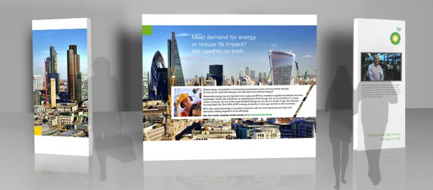
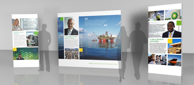
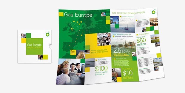
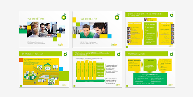
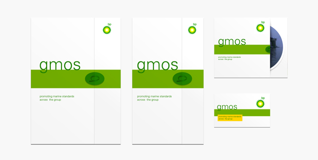
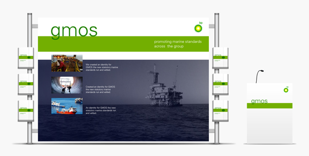
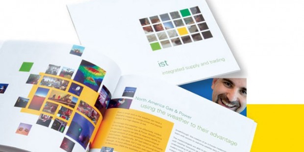
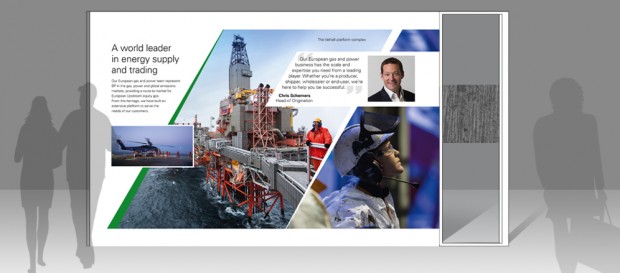
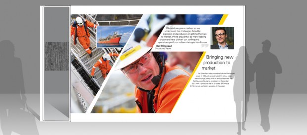
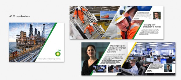
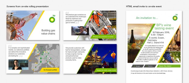
The Bridge has been working with BP’s supply and trading business to design and produce customer communications for international conferences and exhibitions. Our aim has always been to present a consistent and distinctive ‘corporate’ look and feel. These recent designs build on past ideas, but use a dramatic, angled layout incorporating action-styled photography. We convey corporate messages using case histories, but where possible, stories and quotations directly from team members. The stories and quotes help the business engage with directly with customers.

Results

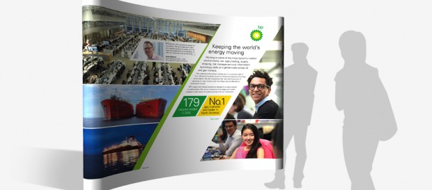
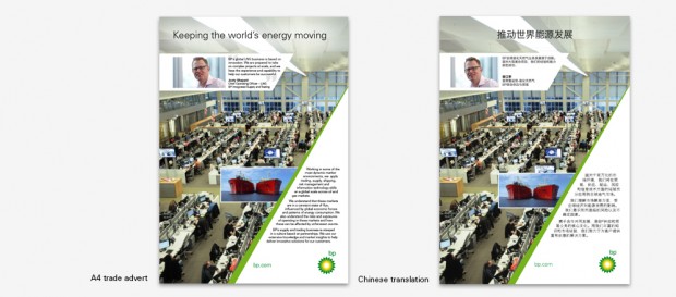
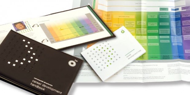
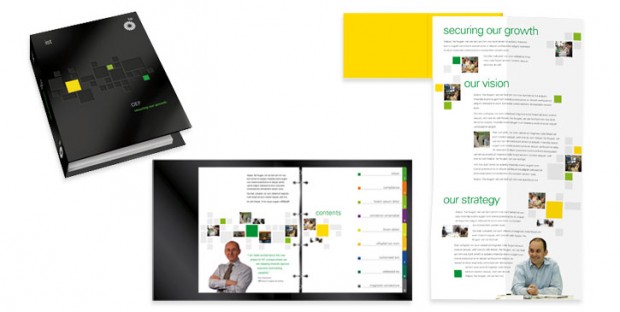
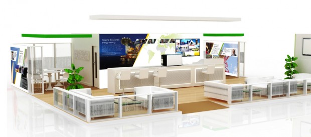
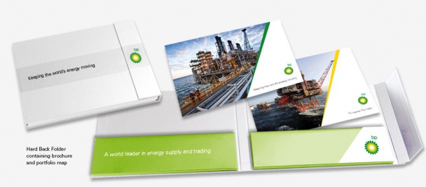
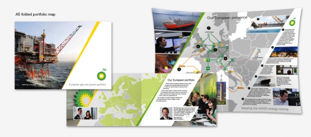
Our designs have been adapted across a range of media, including large format exhibition panels and posters, e-invites and printed invites, folders, brochures and rolling slide presentations. Feedback has always been very positive for our work. In particular at E-World 2016, our communications materials were assumed to have contributed to an investment considered extremely worthwhile. The marketing/branding was seen as relevant, respectable, functional and well laid out and had played its part in generating excellent engagement. In particular our communications helped to support the communications team’s opportunities to generate deal flows from the event.

Comms & Brand Design

Displays and Supporting Materials

July 17, 2014

BP sponsors and attends many international energy conferences. The Bridge was asked to help develop messaging and the look and feel for display and communication materials for a range of events. These include World Oil & Gas Week and the LNG Summit. Our look and feel is developed from a grid-based treatment to reflect a corporate style for use with external audiences – this was later refreshed to give a more dynamic tone. Materials include printed and electronic ads, leaflets and folder designs, as well as large format displays. Our displays comprise standard pop-ups as well as self-supporting light box fabric displays. Our services include transportation and installation of units to international venues.

Results

Feedback indicates all our materials successfully achieved their objectives. In particular they have made a significant contribution to the presentation of a higher quality, consistent and more marketing focused face to external audiences and customers.

Comms & Brand Design

‘Executive Team’ communications

We were asked by BP’s supply and trading division to help with their internal communications. Both the HR function and gas business required materials to support presentations to the executive team. For the gas business we produced a large printed ‘map’ which outlined achievements and successes. For HR we designed and produced a set of slides presenting existing and future plans. Both examples demonstrate our look and feel we developed for internal audiences.

Comms & Brand Design

A Design Supporting Everything that Floats

May 6, 2013

We created an identity for GMOS the new statutory marine standards run and vetted by BP Shipping. A creative idea starting with a rubber duck lead to the representation of a horizon and body of water supporting ‘everything that floats’ within the group – and the more serious notion of a pervasive and official green riband of assurance.

Comms & Brand Design

Clean Seas and Safe Ships

We helped a major shipping business communicate and instill environmental and safety commitments through two campaigns; ‘clean seas’ and ‘safe ships’. Our solutions included a broad range of media and channels. Clean Seas featured key rings made from recycled ship metal, and Safe Ships a video which asked, ‘What makes a ship safe?’

Comms & Brand Design

Mobilising a Workforce

We helped launch this ‘stepping’ campaign to promote health and safety in a large business. Our theme ‘step on it’ and associated designs became very popular motifs for the campaign – which has since been adopted as an annual event. Our designs were applied to all campaign materials –  from digital media to merchandise.

Comms & Brand Design

A Trading Framework

We created a design identity based on a grid representing networking spheres of intellectual and commercial activity. The identity was incorporated into our designs for a recruitment brochure and formed the basis of future design adaptations for other divisions of the business, including a commercial directorate career handbook.

css.php